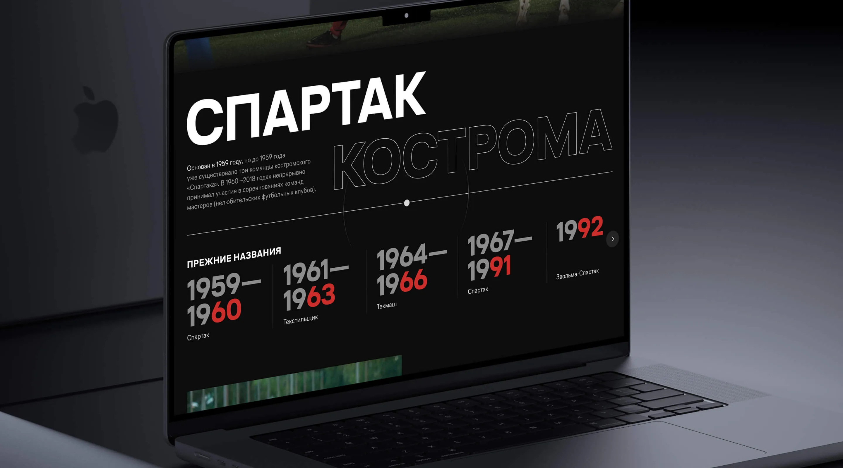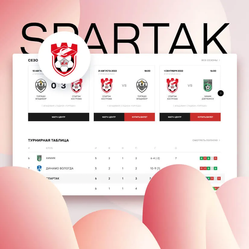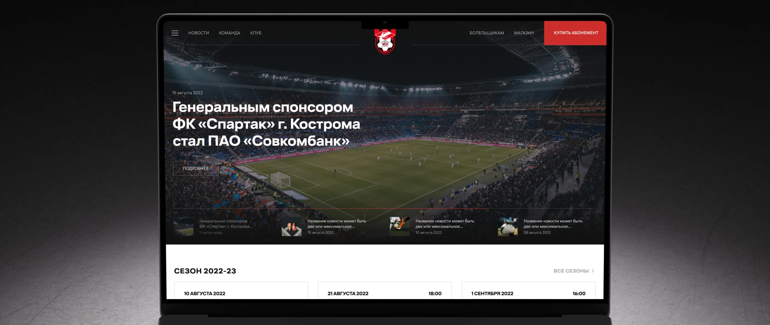
In 2022 we got a request from the football club «Spartak» Kostroma. The club had got a professional status before the beginning of a new season, thus, the managers decided to focus on its promotio
The site was supposed to be the main source of the club’s promotion, which, as was planned, should have helped to gain higher positions for the club in the Second League.
PR team has already used the constructor on Tilda for this purpose. It is definitely a good solution when someone needs to make a simple landing quickly or a simple site without special designer skills. However, the client was planning to make a complex site with additional services. Moreover, it is hard to add non-standard designer solutions on Tilda because the site becomes too heavy and it takes a long time to load it, which is problematic for users. Even in this case when you choose to use a website builder and make a site with its help, the client will need to hire designers and developers.
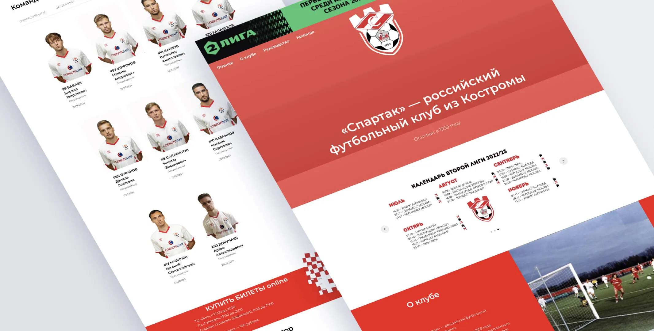
The client decided to hire a professional team for the project and chose us to develop the site. The task was set. The site should have had an image task and that is why it should have been fashionable and eye-catching. The second priority was to make the site user-friendly for all age groups.
The final structure included several sections:
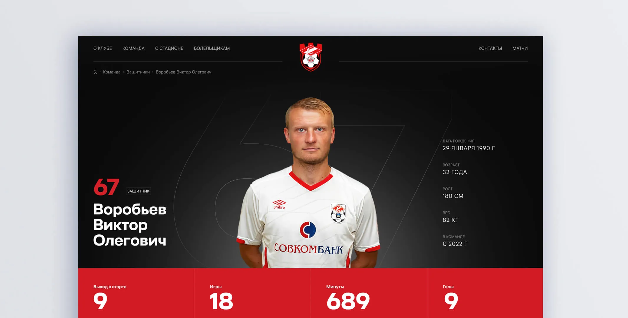
the team — with photos and brief information about each player

the history of the club

the schedule of the coming matches

the information about the stadium

the internet shop where you can buy merches or issue a fan card

the contacts for partners and press-services of sports organizations.

We were interested to work on a project like this. We had some experience making sites for different clients but that was the first time we collaborated with a football club.
The aim was to launch the site quickly, which is why the project was divided into two releases:
We identified common problems of the football sites:
The main disadvantage of the foreign clubs is an old-fashioned design. They are mostly archaic and have a lot of useless information

Russian football sites have another problem. They are overloaded with banners. As a result, 30% of the site is the content and 70% is an advertisement of entertaining events or invitations to visit shops.

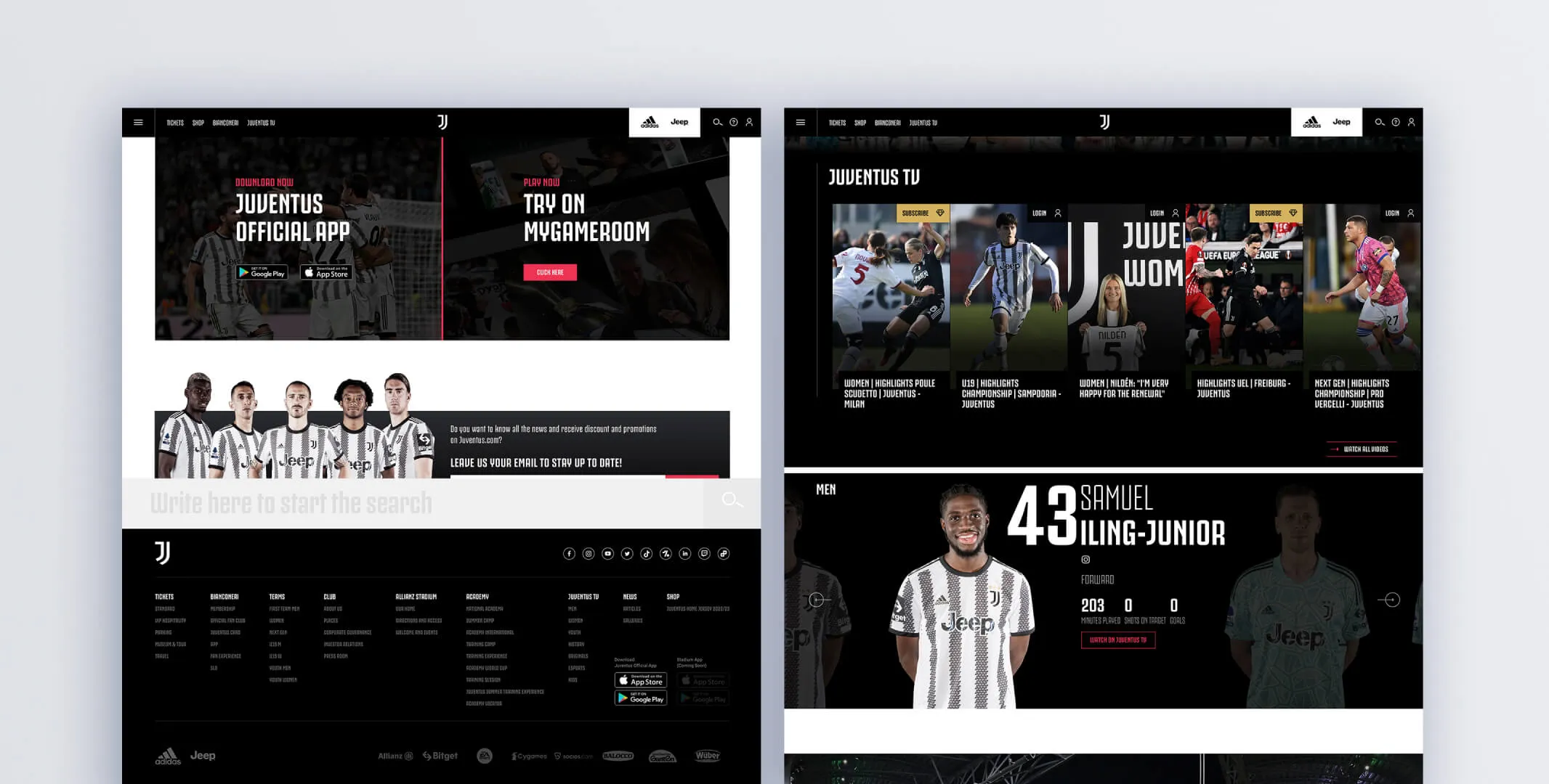
We have analyzed 30 sites of different clubs and have chosen 3 examples to set as a reference. They are Manchester United, Real Madrid and Juventus. Best of all we liked the site of Juventus which has both a good design and a structure. The materials are logically structured, the content is relevant, the design is eye-catching.
There are two ways to make a site either to take a ready-made CMS, like WordPress, and add plugins or to make everything by yourself. We chose the second way because the site will be developed in the future whereas ready-made solutions have restrictions.
A web version was built using the React and PHP Laravel frameworks whereas the mobile version was based on React Native. A database was created using PostgreSQL.
We made a special web page for content editors so that they can change the data on the site. For example, they can upload a new photo of a player and add some descriptions or change the address and the number of seats in the section «Stadium».
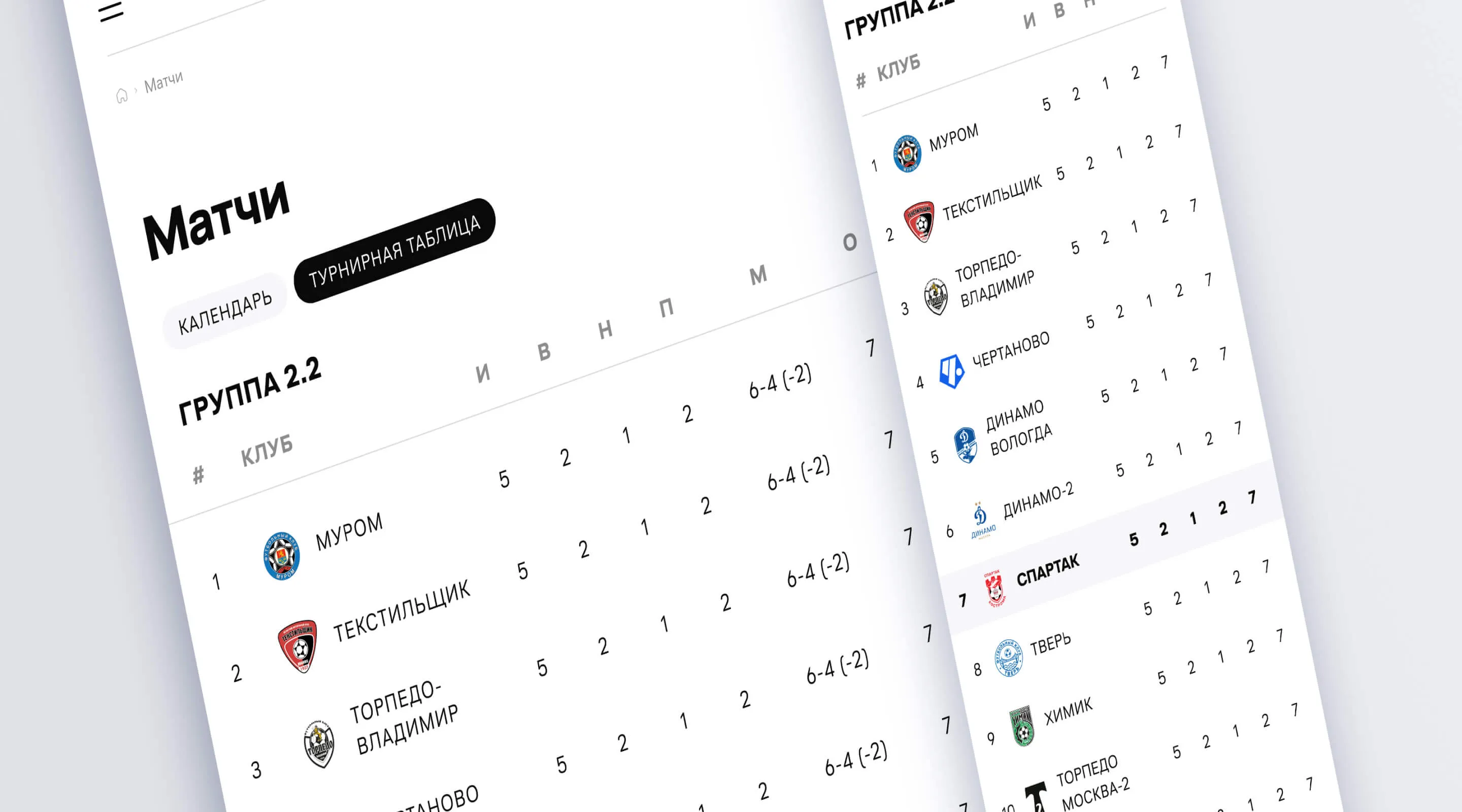
All the technologies chosen make the site adaptive. There is no need to worry about how everything will work similarly on all devices. We created a layout that is easy for imposing and the final version was exactly as designers planned it to be.
During the preparation and development stages, we faced minor problems. The club didn’t have any employees who could set the technical task for us. We involved our analysts and they were directly communicating with the client and then formed the requirements and specifications for the software. It took about a month to set the detailed technical requirements and choose the stack of technologies for the project.
In 2023 we are starting the second part of the project. We’re making a shop with merches, payments, and fans’ registration.
In order to present and agree on the project we prepared animated prototypes and showed parallax scrolling mechanics. The client was able to see the site in a real- life mode.
