In 2022 Sovcombank decided to update the design of its main website: over time it became inconvenient for employees to work with it and for clients to search for necessary information and buy banking products. The bank ordered a redesign from NEOTECH to make the site more modern.
As a result, taking into account the tasks described above, we made a redesign of the five main site sections:
Home page;

Credits;
Cards;
Deposits;
Mortgage.
These sections were put in the first line, so the user can immediately pay attention to the products he came to the site for. In the future Sovcombank will be able to freely change the information on the tabs and promote the most topical areas.
Below we placed buttons with the most popular actions, user requests and a calculator that quickly and clearly shows the benefits of products on specific calculations — with it each of the clients can choose the most convenient options for themselves. The new design «added air» and made the content easier to perceive.
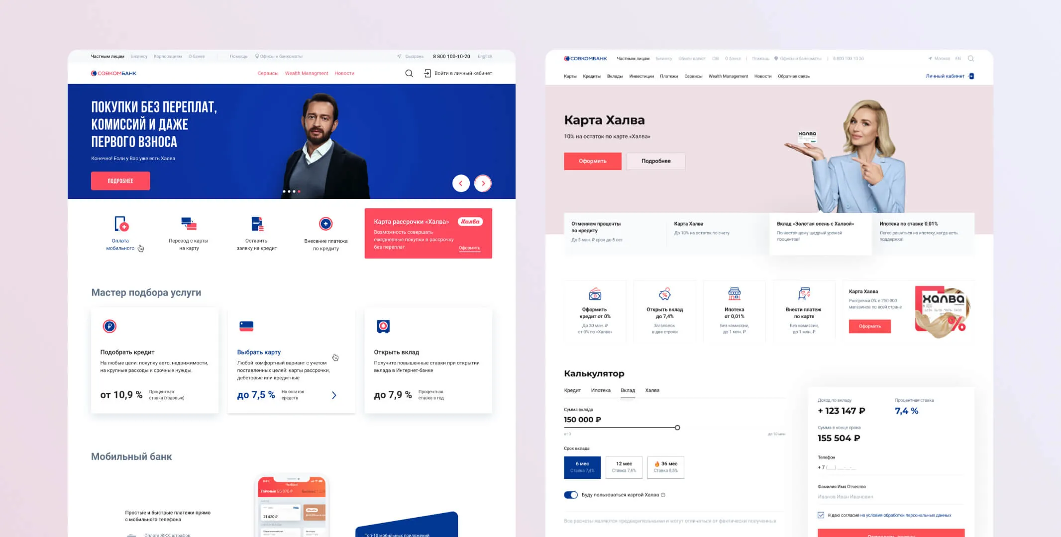
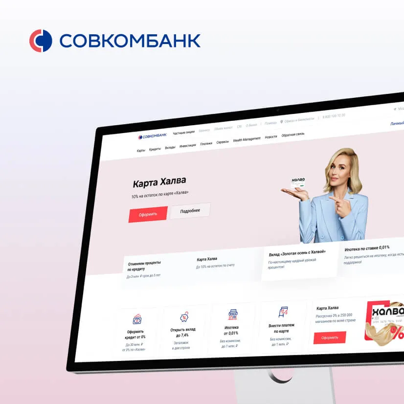
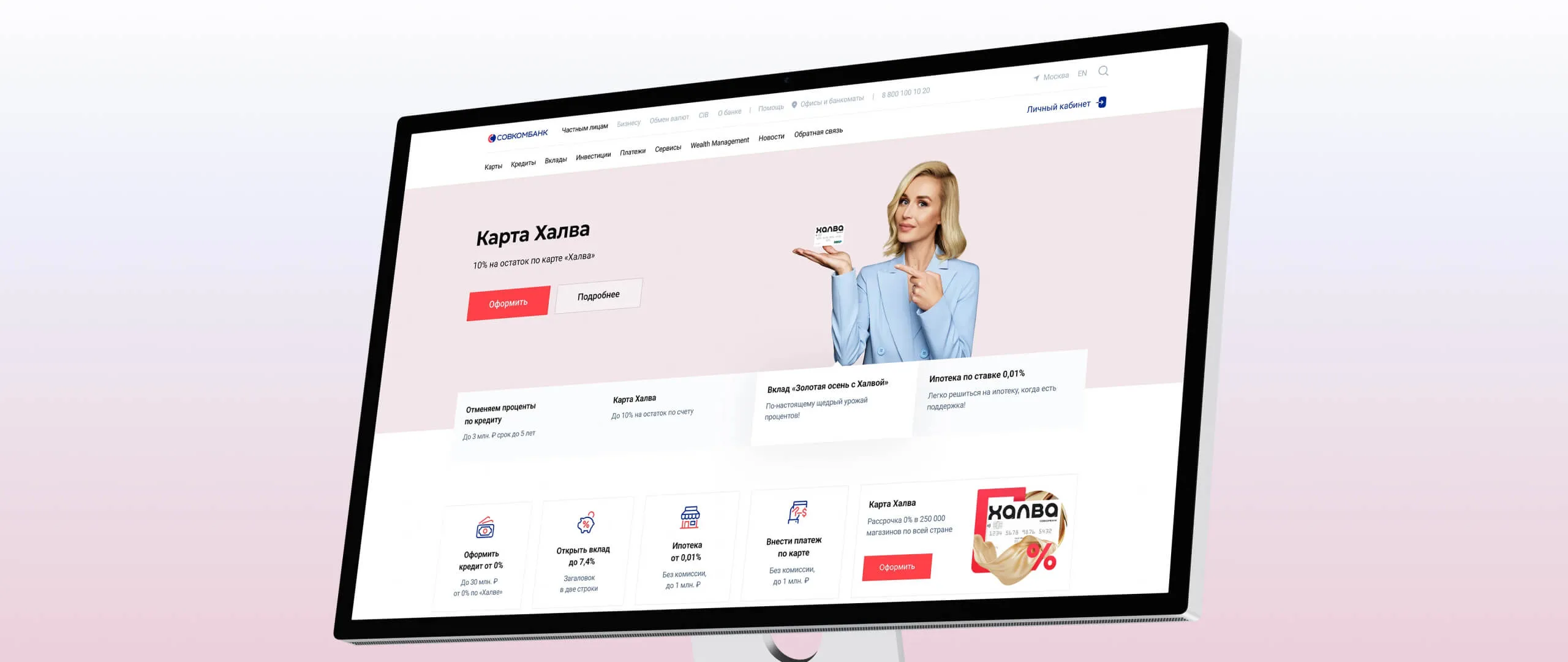
On the home page we added a slider with top offers and a loan and deposit calculator. The bank’s headliner, Halva card, has been highlighted with graphics, and a block with other popular products has been added below.
For the next step our team worked with a set of different products — it was necessary to show the advantages and features of each product in a short and clear way, as well as to facilitate the search through the product line. The graphics helped to visually highlight each product, and the elaboration of the information blocks made it possible to identify the necessary aspects more quickly by a glance at the page.
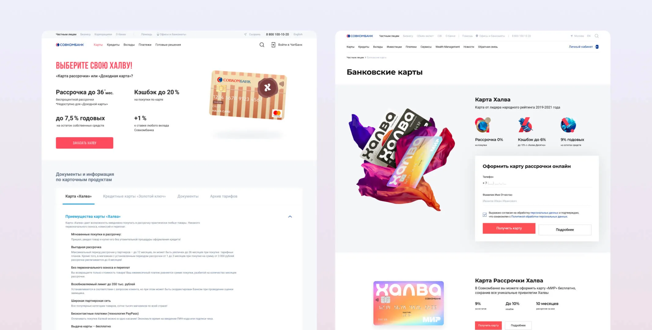
Now the page with cards clearly showed the benefits of the products and also we added graphics to help users better navigate the offerings.
In addition to this information, it was necessary to tell more about each product and it was decided to let the user «to fall» down separate blocks — pages with detailed conditions, where the client could also learn step by step how to apply for a particular bank card.
The credit products page was transformed as well: it was decided to place a banner with basic information at the top of the page, and below all credit products were detailed, supporting each block with auxiliary graphics. Besides, we didn’t forget about the loan calculator, application form and bonus services — all the necessary tools are located next to each other for easy use.
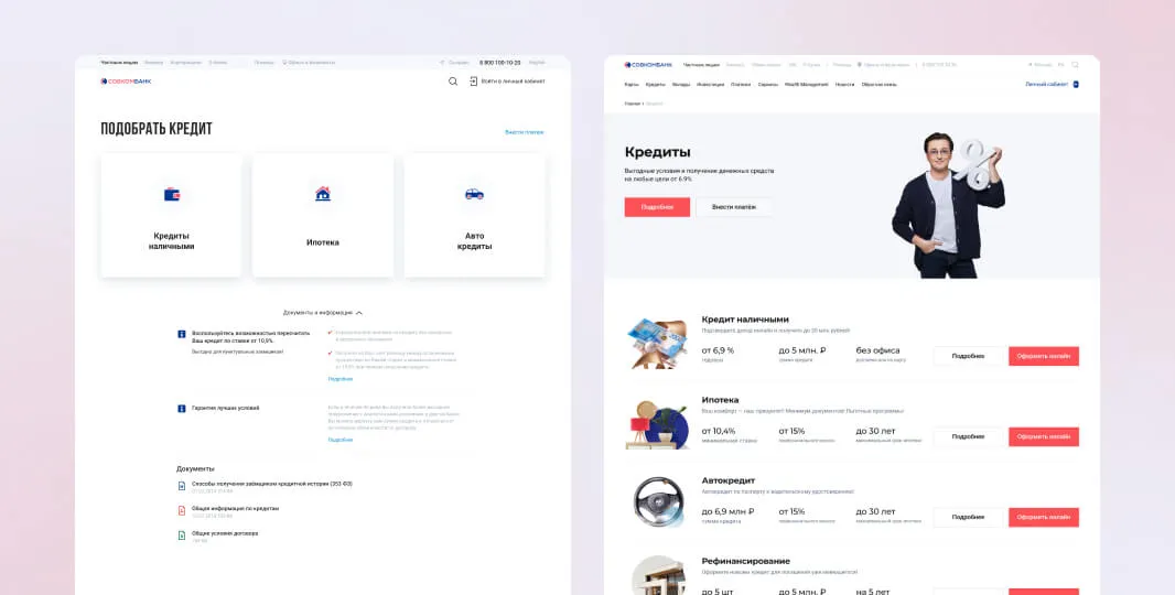
At the top of the page loans we added a banner with basic information, below — a list of all credit products with graphics for each of them, and on the same page — a credit calculator, application form and bonus services.
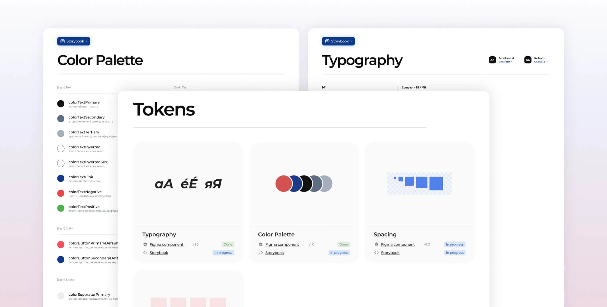
We developed a design system, a structure that brings all the tools and processes in order in the design of the product, for more productive work on the site. It includes a library of elements, templates and rules, a style guide and frameworks for developers. The system saves development time, maintains design consistency, and makes the product user-friendly.
With the help of the design system we solve such tasks:
The complete design system includes:
A set of components with typical site elements;
Rules for design and typography;
A guideline for selecting images.
In this way we reinforce a number of important information: what font to use, what colors to choose for buttons, backgrounds, and other elements, how to use terminology correctly and uniformly, and so on.
As a result, the element can be updated in literally 5 minutes: for example, you change the color of the button → update the component → pass it to the team → the color has changed throughout the site.
We take the components that are used on the site;
Check them against the components of the design system;
Bring them to a common look;
Upload the result to a file;
Give it to the developers;
They immediately use these components in the layout.
The main website sections have been updated: the home page, loans, cards, deposits, mortgage. New design facilitates the perception of content, and implemented calculators help to see the benefits of products on specific calculations quickly and clearly — with them each of the customers can choose the most convenient options for themselves.
Also we specially developed a design system through which we fix important information on the design for further administration of the site: fonts, colors for buttons, backgrounds, and so on.