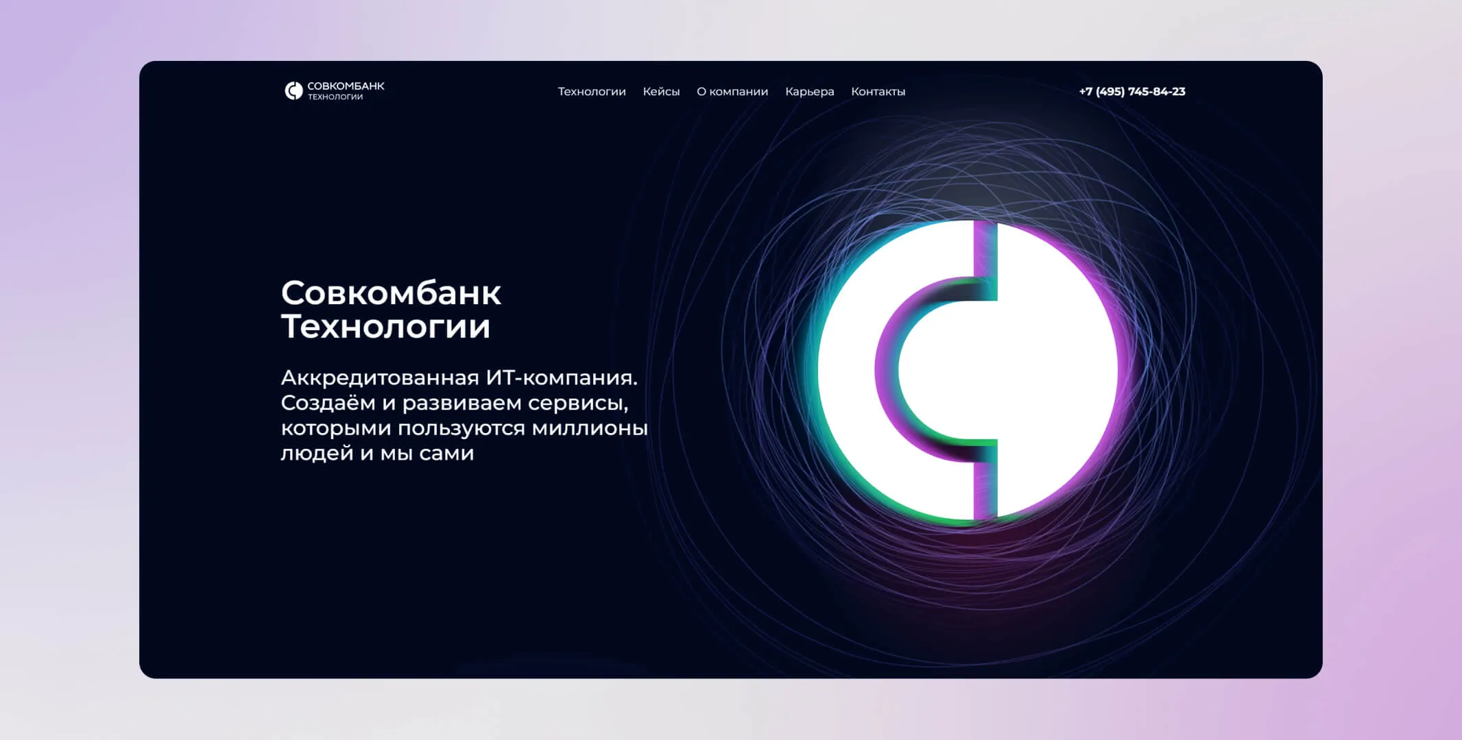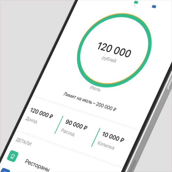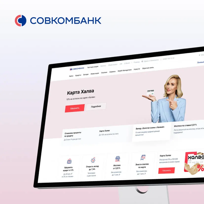
Nowadays banks have gone beyond standard financial organizations — each of them has a powerful IT cluster. «Sovcombank Technologies» is the IT «heart» of the bank, which is involved in projects of absolutely all divisions. For example, this division develops services for «Halva» installment cards, implements the development of AI, launches biometrics products and develops chatbots. The team includes developers, quality assurance engineers, analysts, DevOps engineers and many other specialists — the total number of employees exceeds 3,000.
While working on the «Sovcombank Technologies» landing page we had to take the following subtasks: the site had to provide the possibility to publish information about cases and news of the department, new vacancies. It was also important to reflect two features of the site that unite all the products of the team with the help of design — technologies and innovations.
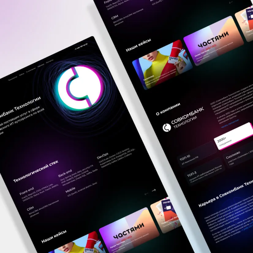
After analyzing websites of different IT companies and finishing benchmarking, our NEOTECH team came to the conclusion that dark color schemes and juicy accent colors are usually associated with technologies. And after selecting references, we prepared a concept that best suited our task: the center of the concept remained a bright element, which should attract the attention of users.
Our idea:
To show technology with a help of simple and clear structure

To show innovation through modern visual solutions in graphics and animation
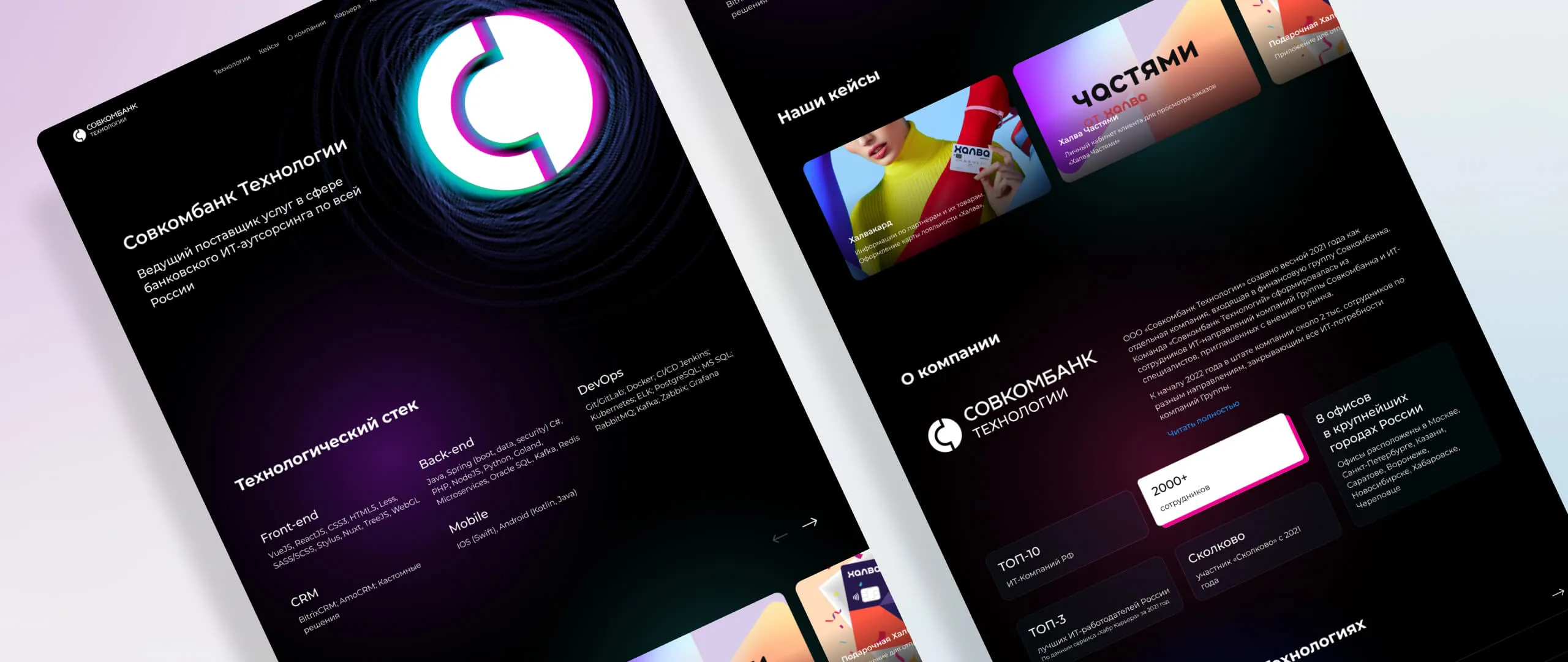
The content was broken into several blocks:
— Languages, frameworks and other team technologies.
— The products which the «Sovcombank Technologies» team developed. We designed them as cards. When the user flips through them, they move smoothly and slow down. This effect is called inertial scrolling.
— The number of employees, position in the employers ranking and other general information. The information blocks we designed with stencils and added a retro effect to show dynamics with a colored shadow when pointing and highlighting.
— A section with vacancies to join «Sovcombank Technologies» team. We added a static color glow to the text.
Unfortunately, not all of the desired effects could be realized in practice. For example, we planned to make a glowing spot that follows the cursor, but this effect turned out to be too «heavy» for common computers.
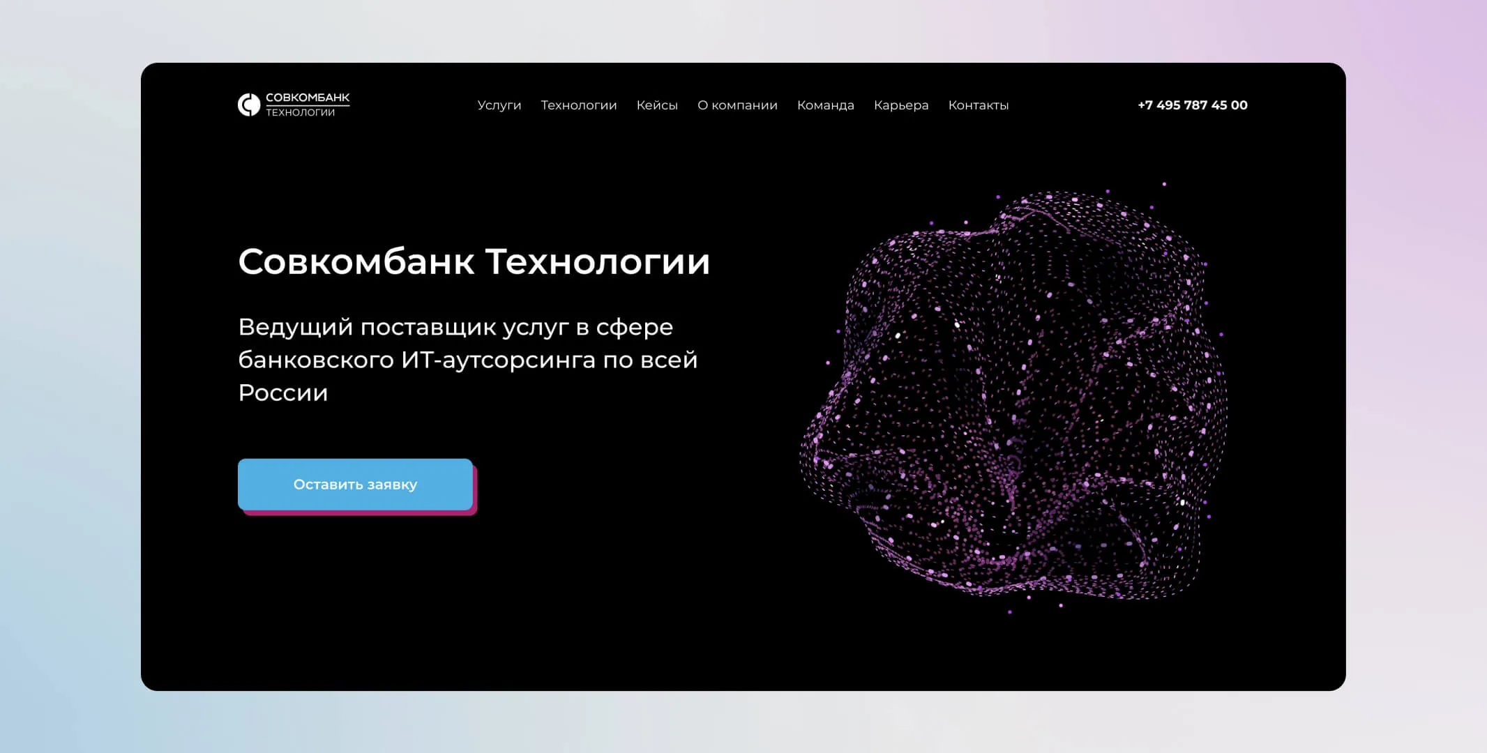
After working out the basic structure of the landing page, we returned to the implementation of the bright element — the highlight of our concept. We prepared an unusual animation of the logo for the main page, tailored to its shape — the backlighting and movement of the background gave it a modern outline and got rid of static: the bottom of the logo is supported by spheres floating on waves, every few seconds it has a glitch effect — visually it resembles an electric discharge.